
My oldest brother Richard wasn’t the master of sarcasm that our middle brother Steven was. But he still looked at my game’s box with a caustic smirk.
“This-“ he said, first looking at the art on the box cover of cover of Atari’s Air-Sea Battle…

and then looking at the blocky, pixelated screen of the game itself on the TV,

“This looks nothing like the actual game!”
“Well, I like it.” I was thirteen. Verbal, but not very articulate for my age.
“Whatever,” he said, rolling his eyes and leaving the room.
I am not being holier-than-thou. Goodness knows I had my share of being the ankle-biting, annoying kid myself growing up. But it did make me take a second look at the cover art for Atari’s games. Even comparatively lamer offerings like Othello had an intricate-looking mystic guy languidly stretching out his hand like Adam in Michelangelo’s Creation of Adam as a pinpoint of light flashed from his index finger,

turning a section of his floating green glass table a brilliant white.
Yeah, it didn’t look much like the actual game, either.
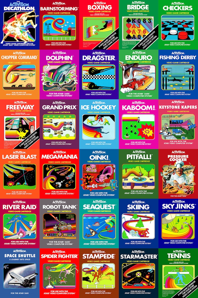
Third-party providers like Activision took a different tack, doing a stylized version of the games’ blocky graphics themselves, always with the main sprite trailing a blazing, active rainbow behind it. Colecovision’s offerings were less inspiring, often only showing a picture of the arcade game that the cartridge was based on.
Critics like my brother did perhaps have a point; the art on an Atari game’s box didn’t bear more than the most symbolic similarity to anything that you saw once the cartridge was in the slot and the power was turned on. But did that really matter?
Well, yes. Yes it did.
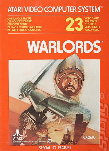
Nearly Forty years removed from the day I first opened the Christmas present that contained my Atari VCS, I remember the grizzled Clint-Eastwood-lookalike on the cover of Outlaw, the ominous half-dome alien ship with its triple pinprick lasers on the cover of Space Invaders, the noble knight swinging his sword on Warlords, or the frightened expression of the woman being beamed up by the lander on Defender. Not so for other game systems. whose box art I had to look up on the internet.
Even though gamemakers like Activision made awesome games, I’m not aware of any nostalgia connected to their games’ box art. Or Intellivision’s, ColecoVision’s, or Odyssey 2’s for that matter. Why is it so many of us can recall to this day what the covers of the Atari games looked like forty years or more after they first were torn open by our eager little hands?
Making the games look like a piece of art was an intentional move by Nolan Bushnell, then the head of Atari games. “I felt fundamentally that this was a consumer product that needed all the care and attention that a record album did,” Atari founder Nolan Bushnell said in his interview with Polygon. “At the same time, I wanted to have something that was beautiful and instructive and I wanted the artwork to have a consistency to it, so that immediately, when you glanced at our packaging, you knew it came from Atari and you knew it was beautiful.”
The goal was to create an image that would be synonymous in the mind of the consumer with the product. Much the same way that an album cover will be synonymous in the mind of the music fan when they hear ‘their’ band’s popular songs on the radio. “We were the latecomers,” Bushnell continued, “so we had to be better than what was out there. It was just a feeling of, in some ways, inferiority. We always felt we were little guys compared to movies and records at the time. We felt that in order to establish ourselves as a serious industry, we had to be better.”
Plus, uniformity in fonts, style and other aspects of art fed the imaginative life of more than one little middle schooler. In my case, My brain would bounce around semi-fantasies about being a gunslinger, slaying dragons, fighting aliens, or defending pretty women from said aliens. And all thanks to the beautiful artistic renditions of the art on the Atari boxes.
It’s hard to argue that it wasn’t effective. It’s true that back in the late 70s and early 80s some praised Mattel’s Intellivision for its superior graphics, or ColecoVision for being an overall superior system for arcade ports. But in terms of raw sales and number of players, Atari was the unquestioned 800-pound gorilla of the home-video entertainment systems.
The current retro-market overwhelmingly favors those of us who loved our Ataris as wee lads and lassies. And while none then made a huge deal about the box art back then, none of the many other systems vying for a bite of the home video pie in the 80s era can today boast of successful coffee-table books based on the box art of its games the way Atari can.
JDM


